#1
Gender & Visualizing Uncertainty
 This project was inspired by a statistic I heard almost a decade ago, that up to about 1% of the US population
identifies as trans or gender nonconforming (TGNC). It came with the caveat that actually, we have very little
good
data to figure gender statistics in the US, and the number of TGNC people could be half that number, or
potentially
double that number. There was insufficient data to be anywhere near certain.
This project was inspired by a statistic I heard almost a decade ago, that up to about 1% of the US population
identifies as trans or gender nonconforming (TGNC). It came with the caveat that actually, we have very little
good
data to figure gender statistics in the US, and the number of TGNC people could be half that number, or
potentially
double that number. There was insufficient data to be anywhere near certain.
A 2016 study from the UCLA Williams Institute is widely regarded as having the best numbers on this question, and it reported that 0.58% of the US population identifies as trans – the 95% credible intervals put that number anywhere between 0.35% and 0.95%, a difference of more than 1.5 million people. The study took its data from the Behavioral Risk Factor Surveillance System and reported estimates for all 50 states, even though only 19 states included the optional module with questions about transgender status.
The 2020 Census could have been a resource for learning more about the TGNC population of the United States, but it is literally useless for trying to answer any questions about trans people. The Census asked about people’s sex, not gender, and offered only two categories: “female” and “male.” In addition to failing to count intersex Americans or those with differences or disorders of sex development (potentially as much as 1% of the population), these options don’t even touch on categories of gender identity like trans, two-spirit, or nonbinary.
After two years of this program, and a semester specifically considering alternative data cultures, I’m definitely feeling critical of the idea that clean lines and sleek visualizations are the best way to represent the inherently complex, poorly datafied realities of sex and gender. Instead, the medium should be able to gracefully represent uncertainty rather than projecting false confidence, allow space for boundary-crossing rather than requiring strict categorization, and prompt users to think critically about an idea rather than aiming to simply impart a number or statistic.
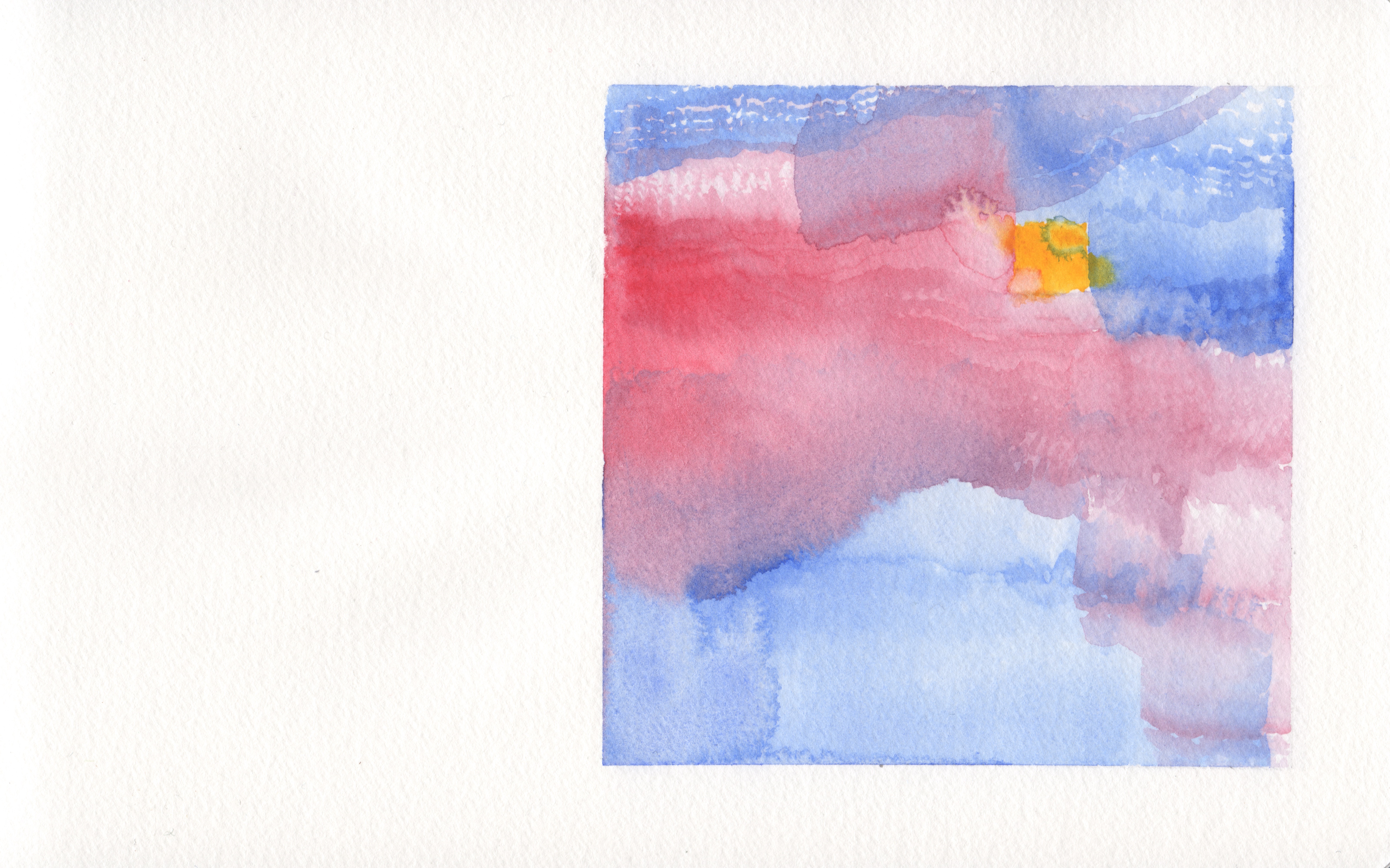
I settled on watercolors as one way of accomplishing this. Thinking about that 1%-but-actually-we-don’t-know statistic for TGNC people, I measured a square that is 1% of the painted area. Outside the square is mostly shades of blue, red and purple, and inside is mostly yellow. Some of the blues and reds seep into the square, some of the yellow leaks out, and the colors mix and abut differently at different boundaries. The square is a visible shape for reference, but by no means a concrete delineation. Rather, it signifies a potential 1% square as a point of context, with the actual area impossible to calculate.
I join Catherine D’Ignazio and Lauren Klein in challenging big dick data and respond to Giorgia Lupi’s call for soft data and data humanism. I'm similarly inspired by Kim Brillante Knight's emphasis on hand-made data storytelling as a way of bringing data visualization back to its initial purpose: effective communication. Lupi’s hand-drawn approach (and mine) might sacrifice some level of precision or accuracy, but the tradeoff is hopefully some level of critical thought about the extent to which we should trust or be skeptical of conclusions that are presented as cut and dry “because data.”
#2
Race & Visualizing [Un]classification

Having considered one US Census question, I thought about other ways conventional data viz can prove counterproductive in answering complex questions. The Census categories for race were another obvious point of focus.
The inspiration for this second watercolor is that the 2020 Census’ race categories are carved, somewhat arbitrarily, out of a tapestry of human origins that is endlessly more complicated than five categories and “some other race.” In this visualization, the six foundational race categories for the 2020 Census are represented by the flat silhouette of a bar chart against a fluid backdrop of earth and/or skin tones.
Part of this watercolor’s thesis is that race is invented, not discovered. There is no magical arrangement of words on the Census that will return a complete and accurate breakdown of the racial make-up of the US. The Census will always return only the answers to the questions it asks, and in doing so will continue to define race while it claims to report it.
Because there is no magical arrangement of words that would accurately report or define race, it’s all the more important to be comfortable with and knowledgeable of the shortcomings of any one definition. Taking the Census in its historical context is important; recognizing that whiteness is its most historically stable racial category is important; and listening to those who are dissatisfied with or confused by the categories is important.
Again, the watercolor medium invites the viewer to think about layered sets and boundary-crossing rather than strict categories. In this case, the simple numbers (bars representing 76.3%, 13.4%, etc.) are not the point; the landscape around them is clearly supposed to command the viewer’s attention in this visualization.
While researching census questions for this painting, I found that the historical census race questions I read were interestingly illustrative about bias. Their motivation regarding race was so obviously in service of white supremacy that it was easy to understand why the questions were asked in the manner they were. The 1930 Census gave a limited list of options for “Color or race”—these were white, Negro, Mexican, Indian, Chinese, Japanese, Filipino, Hindu, and Korean. After these categories, participants are instructed, “For a person of any other race, write the race in full.”
There are obvious problems. Seven of the ten options are nationalities or religions, and only “white” remains a relevant term and category of race. That’s unsurprising, since racial categories in the U.S. have always centered a definition of whiteness. (The word “Negro,” by the way, wasn’t removed from the Census until 2013.)
But the question is incredibly instructive in its obvious lack of objectivity. The same is much harder to see in current day questions—many of the same white supremacist motivations remain today, but they’re couched in the language of modern, datafied liberalism. We expect, because as liberal subjects we are taught to view data as complete and objective, that answer categories should reflect the full spectrum of possibilities. It was actually a bit refreshing to pull back the curtain on liberalism and see a question that asks for the answers it wants and lets everyone who isn’t covered write in their own responses. This question is obviously oriented around white people, and it obviously wants to count different Asian populations in the United States. (Unlike today’s census, it actually counts Asian-American people from different origins as distinct populations.)
The 1930 Census also defined categories at the level of granularity that was potentially culturally relevant, rather than pre-aggregating categories for respondents into groups that vaguely describe lots of people and specifically describe few. Indeed, according to the Pew Research Center, “In the 2010 census, 37% of Hispanics—18.5 million people—said they belonged to ‘some other race.’ Among those who answered the race question this way in the 2010 census, 96.8% were Hispanic. And among those Hispanics who did, 44.3% indicated on the form that Mexican, Mexican American or Mexico was their race, 22.7% wrote in Hispanic or Hispano or Hispana, and 10% wrote in Latin American or Latino or Latin.” When categories are insufficient or irrelevantly aggregated, people are miscounted. Visualizations predicated on the idea that census categories accurately represent “the truth” of race in America will always contribute to these miscounts.
Watercolor #2 aims to show that race categories are carved out of a field that inherently resists sterile, stable classifications, but is instead historically and socially determined.
#3
Disability & Visualizing Responsibly

Finally, I wanted to finish this series with a critique of one more category that insufficiently represents the people it claims to describe. Good data on disability is notoriously difficult to collect. Today, scholars of disability studies use qualitative data and significantly different theoretical frameworks for studying disability than the quantitative data collected largely by medical bodies.
Evan Baughman, a friend and PhD candidate in Sociology focusing on the sociology of disability at UC Davis, told me that “‘good’ quant[itative] data on disability doesn’t really exist yet while everything on it is still under the purview of medicine.” Instead, he says, “disability studies in general is really slanted towards qualitative work because the quantitative side is pretty dominated by medicine and seen as oppressive… [T]he social model [of disability] is a good framework to explain why things are so bad.”
Importantly, the category of “disabled” can and does mean many different things depending on the context in which its used, and it can be used to refer to groups of individuals with vastly different experiences of the world and needs in relation to disability. A statistic on “how many disabled people live in the US” is likely to be, at best, mostly unhelpful in its broadness, and at worst, misleading and/or damaging in how it defines disability.
The social model of disability rejects overmedicalized, individualist perspectives on disability and points instead to disability as a “culturally and historically specific phenomenon” (Tom Shakespeare, "The Social Model of Disability"). From an alternative data cultures perspective, it’s apparent how conventional categorizations of people as disabled may be futile, irrelevant, or arbitrary for data analysis/viz purposes, and in fact we might be better served and more responsible practitioners by cataloging the ways in which societies define ability in the first place.
Baughman also pointed out a few examples of potential logistical pitfalls that arise when quantifying disability. For one, deaf people frequently don’t self-report as disabled and claim to be a linguistic group. For another, many more poor people and people of color won’t be diagnosed with a disability simply because they can’t get to a doctor, despite the fact that they are disabled at higher rates. And in general, the healthcare system is the driver behind quantitative disability data collection, so as long as inequities and disparities regarding socioeconomic status, gender, race, geography and more exist within healthcare, these will be reproduced in our data about disability.
I’m by no means well-versed in disability studies, but I’m certainly looking forward to reading more after this experience. As far as data viz is concerned, I’m grateful to have some baseline ideas to consider. First and foremost, visualizations about disability and disabled people should be made and considered with caution and care towards representing relevant categorical distinctions, and presented with sufficient qualitative context to explain the shortcomings of quantitative or categorical approaches.
In lieu of this, my final watercolor aims to represent a field for which data visualization may tell us little to nothing. There is no graph, because it may be better, at this point, to use data viz sparingly and with context, or not at all. The fully painted “extradiegetic” space and lack of a “diegetic” visualization also alludes to the reality of disability as distinct from impairment, and culturally and historically determined rather than an intrinsically “true” or stable category.
Conclusion
This project has convinced me of the merits of bringing watercolors into my practice as a data viz developer. I love how the medium foregrounds uncertainty, liminality, and variability in its visual language, and there are obvious use cases for bringing that language to the field of data visualization. I’ve also found that approaching data viz from a more overtly artistic standpoint has encouraged me to think critically about the ways in which data sets are constructions of reality, not simply representations. As far as responsible data viz practice goes, both of these are crucial considerations, and I’m excited to see how this deep reflection on an analog process will inform my future digital data visualizations.
This is a final project for Alternative Data Cultures, taken Spring 2021 at the CUNY Graduate Center with Prof. Kevin Ferguson.