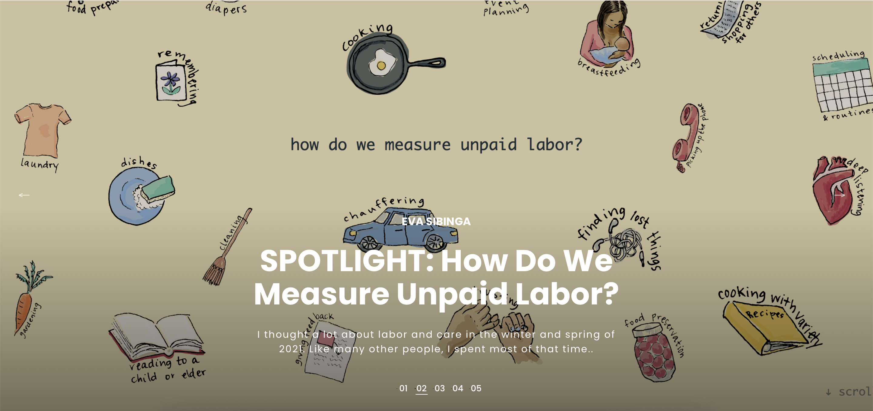
Spotlight: How Do We Measure Unpaid Labor?
follow-up thoughts on
this project
,
published in Nightingale, January 2022
Cognitive Load as a Guide: 12 Spectrums to Improve Your Data Visualizations
co-authored with Erin Waldron
published in Nightingale, September 2021
featured on
Best of the Visualisation Web
September 2021
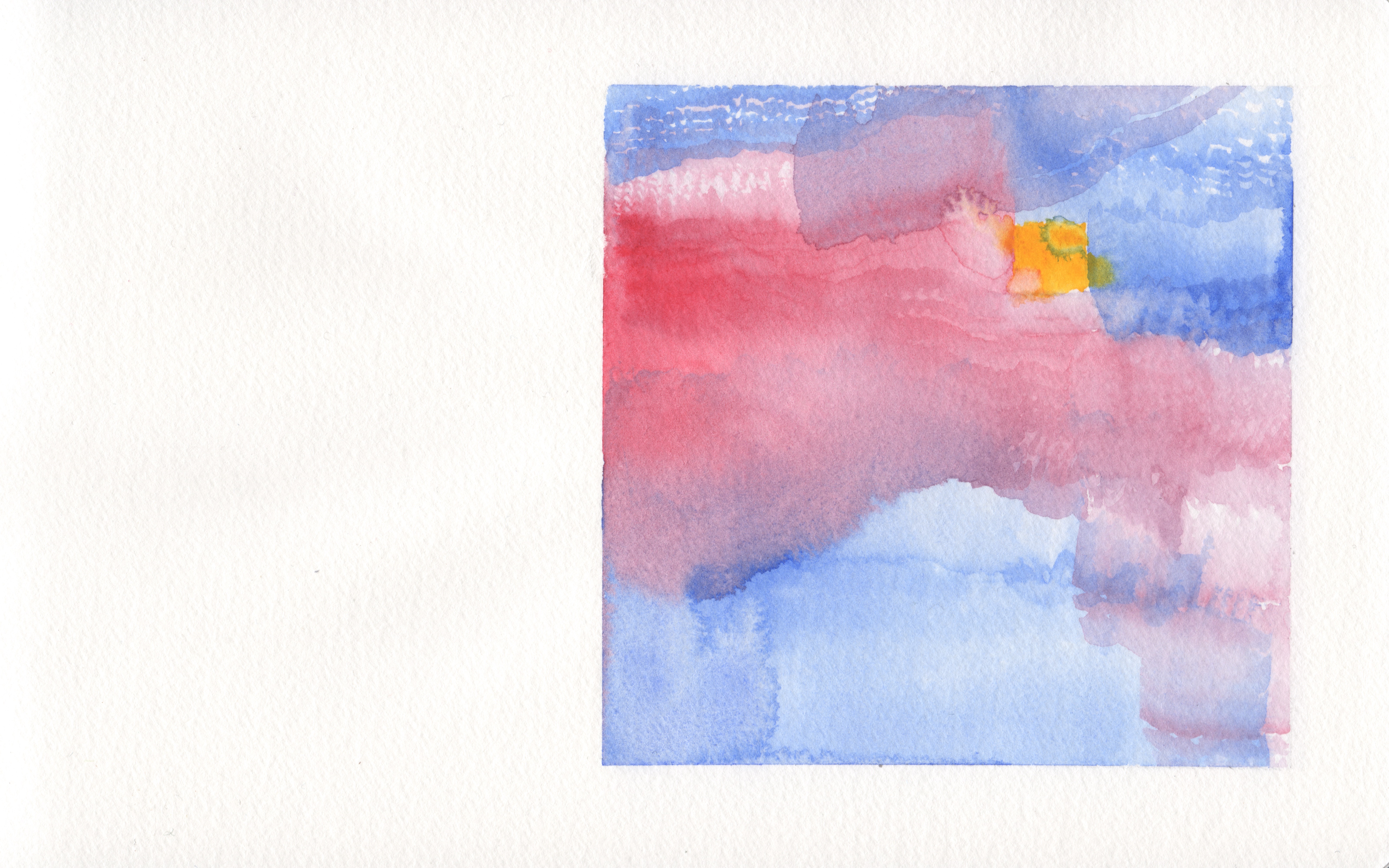
The Case for Watercolor Data Viz
musings on data viz with watercolor paint
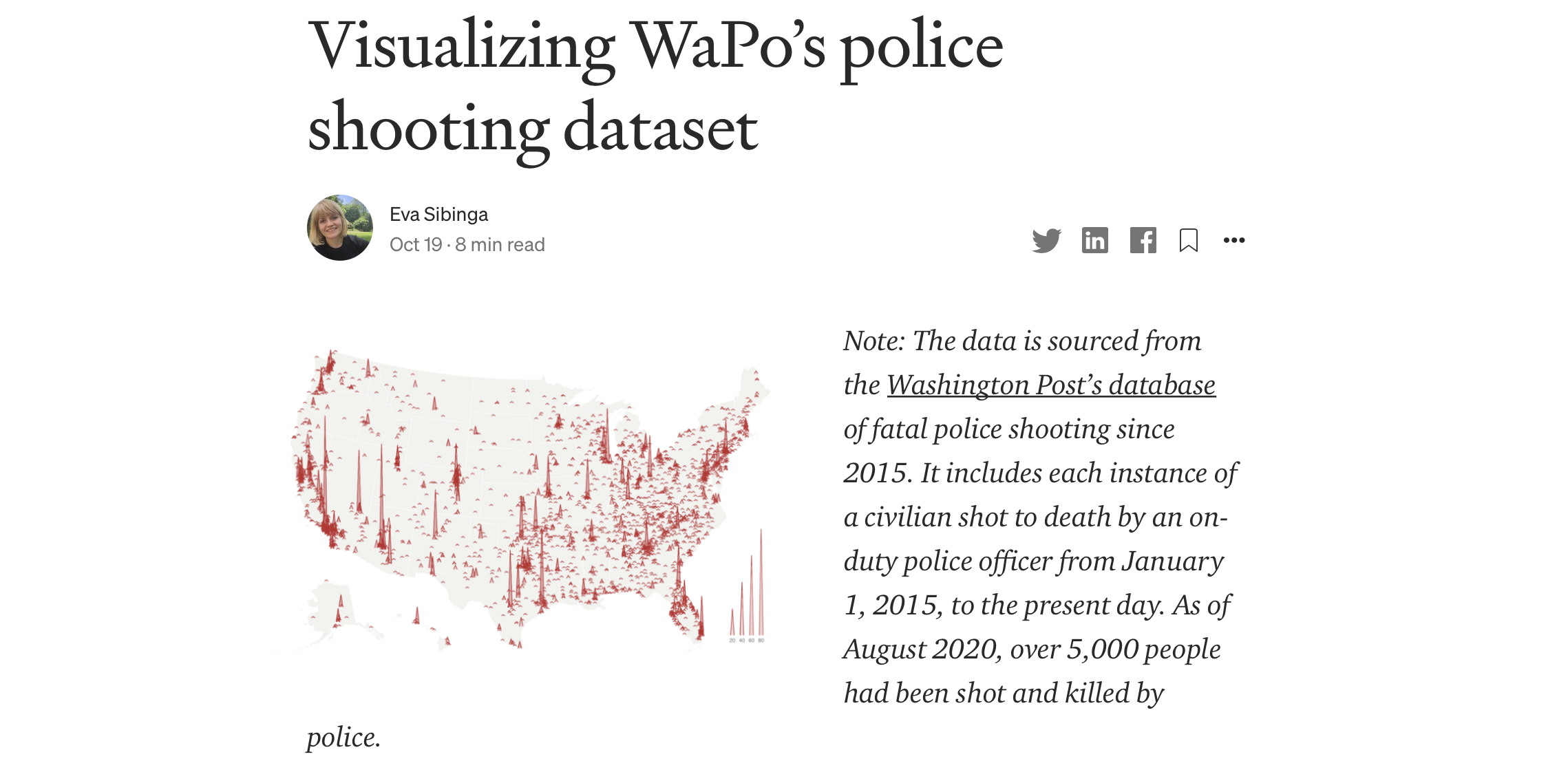
Visualizing The Washington Post's police shooting dataset
published on Medium for TWO-N Studio, September 2020
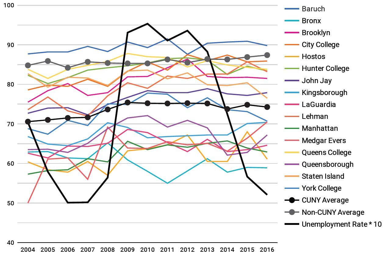
Report on COVID-19’s Impact on CUNY Students
Data For Public Good
co-authored report | R | Google Data Studio
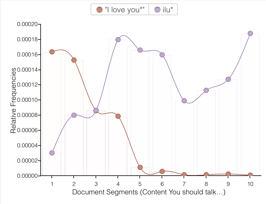
Text Messaging:
Not A Hot New Epistolary Form
R | Voyant | CUNY Academic Commons